Order Size & Data Size Don't Match Up
Data Submission Guideline
The Data Creation Guide
We've put together some helpful guides to walk you through preparing your artwork for print. Just like you, we want your project to turn out perfectly every time! These straightforward guides will help you avoid common pitfalls and make sure your design comes out looking exactly the way you envisioned it.
Whether you're brand new to design or have years of experience, we recommend taking a look through our guides. When you follow these tips and send us properly prepared files, you can sit back and relax, your design will print beautifully, every time.
Printing Basics
- The difference between RGB and CMYK
- Specifying orientation on your print data
- Ink rubbing / ink transfer
- About halftones
- Regarding the trimming process
- Print Sizes
- Recommended software
Frequently Overlooked Mistakes
Here at PrintNavi, we carefully review all submitted files to make sure they're ready for printing. If this is your first time ordering with us or you're still getting comfortable with preparing print files, this guide is here to help!
Below are some common mistakes to watch out for when placing your order. Taking a few minutes to review these tips will help ensure your prints turn out exactly as you'd like.
Please note: PrintNavi cannot be held responsible for print issues that result from improperly prepared files. We're here to help you get it right from the start!
Order Details & Data Specs Don't Match Up
If the print colors don't match between your order details and the uploaded files, we'll need to put your order on hold until we can confirm the correct specifications with you.
For example: If you order both sided color flyers but upload a file that only has one side we'll reach out to clarify before proceeding.
Relevant to:
Illustrator
Photoshop
InDesign
Single-sided color
Both-sided color
If the size of your uploaded file doesn't match the size you ordered, we'll need to pause your order until we can confirm the correct size with you.
For example: If you order A5 size flyers but upload a file sized for A4, we'll get in touch to make sure everything is correct before printing.
Relevant to:
Illustrator
Photoshop
InDesign
Order size : A5
Data size : A4
Have You Converted All Text to Outlines?
If your text hasn't been converted to outlines, there's a chance we may not have the specific fonts you used in your design. Without them, we won't be able to print your file as intended.
Relevant to:
Illustrator
Are Your Images Properly Embedded?
Make sure your images are embedded in your file, not just linked to an external location. If images are linked or missing, we won't be able to move forward with printing your order.
Tip: Embedded images are saved directly into your file, so everything we need to print travels together in one package!
Relevant to:
Illustrator
Linked file.
Embedded file.
Missing linked file.
Additional Finishings?
If your order includes any special finishings (like folding or perforations),please make sure to include the necessary marks in your file.
Without the proper marks or indicators on your artwork, we won't be able to process your order as requested.
Tip: We recommend using our print templates for all products. If you're still not sure, please contact us, we're happy to help you get it right!
Relevant to:
Illustrator
Photoshop
InDesign
The 9 Point Data Checklist
Setting up files for print can feel tricky, especially if you're new to it. We want to make sure your print job turns out exactly the way you envisioned! Before you upload your artwork, take a moment to run through our checklist, it'll help catch any issues before printing begins.
Thinking about a large order? Feel free to reach out to us first! A quick consultation can save you time, money, and ensure everything goes smoothly from the start.
Irregular Data Size
If you upload a file that's smaller than your order size and everything else looks good, we'll assume you intentionally want this custom size. We won't automatically expand or shrink your file to match the larger ordered size.
For example: You order A5 flyers (210x148mm),but your uploaded file is 200x99mm. We'll print and cut it at 200x99mm as per the submitted file.
Note: If this isn't what you intended, please double-check your file size before uploading!
Order size : : A5 (210 x 148mm)
Order size : : 200 x 100mm
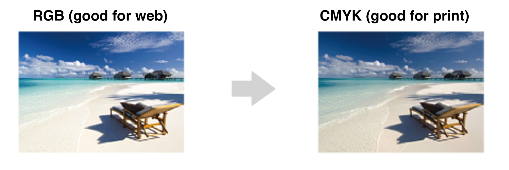
Colour Settings and Colour Mode
If your file was created in RGB colour mode, it will need to be converted to CMYK for printing. When this happens, you'll likely notice a shift in colors, they may look a bit different and slightly darker. This is a normal part of the RGB to CMYK conversion process.
Best practice: Always design in CMYK colour mode from the start when creating artwork for print! How to set your colour mode to CMYK:
Go to Edit > Color Settings
Look for the 'Working Spaces' section
Select 'Japan Color 2001 Coated' from the CMYK dropdown menu
Click OK
This ensures your colors will print as close as possible to what you see on screen.
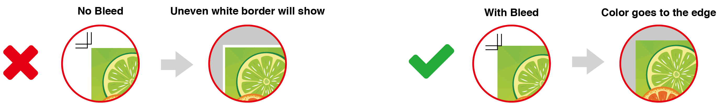
Bleed
All print files need a 3mm bleed, this is an extra area that extends beyond the cut line. The bleed accounts for small shifts that can happen during the trimming process, ensuring your design prints edge-to-edge without any white borders.
Tip: Think of bleed as a safety buffer! Extend your background colors and images into this area, but keep important content inside the safety zone.
Text Is Not Within the Safety Area
Make sure to keep all logos, text, and important design elements inside the safety zone. Anything placed outside this area risks being cut off during trimming, which could lead to unexpected results.
Safety zone guideline: Keep important content at least 3mm away from the cut line.
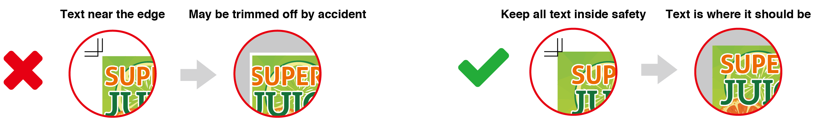
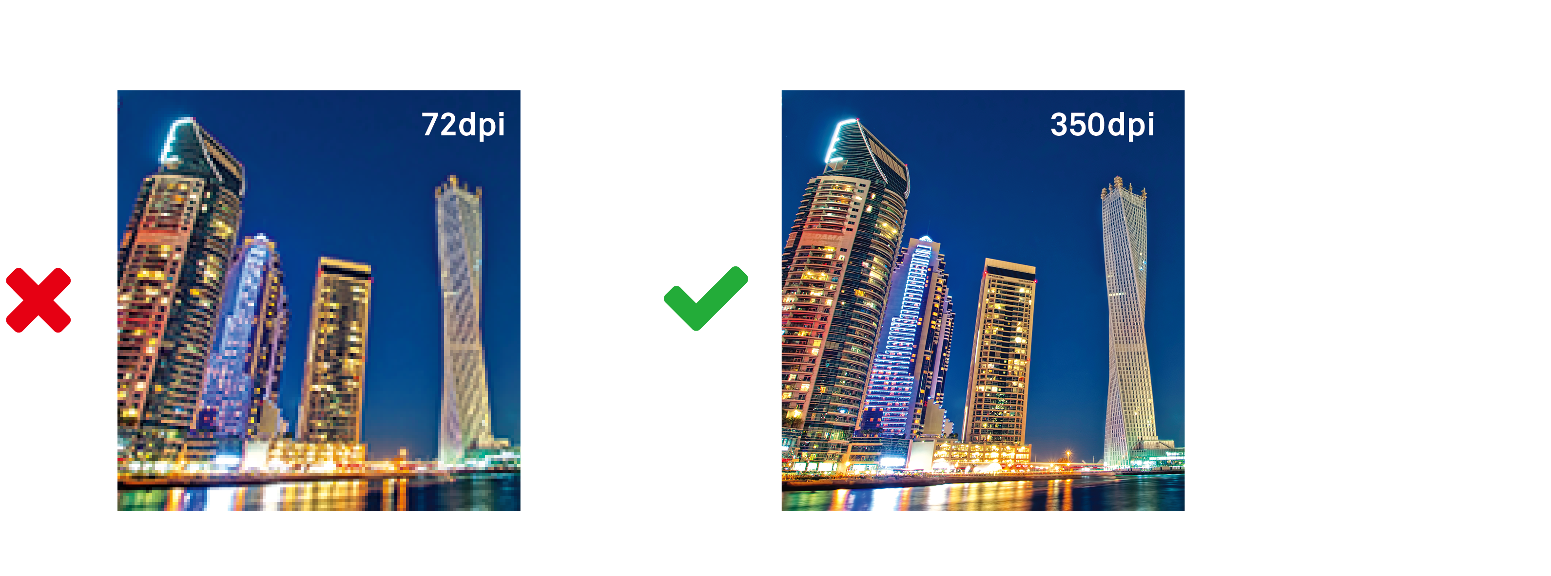
Image Resolution
Low-resolution images can make your finished print look blurry or pixelated. To keep your prints looking sharp and professional, all images need to be at least 300 dpi (dots per inch) at their actual printed size.
Heads up: Images downloaded from websites are typically only 72 dpi, which looks fine on screens but won't print well. If possible, use high-resolution source files or professional stock photos for the best results.
For logos and graphics: Make sure these are either vector files (which scale perfectly at any size) or high-resolution images at 300 dpi minimum. Otherwise, they may print looking grainy or blurry.
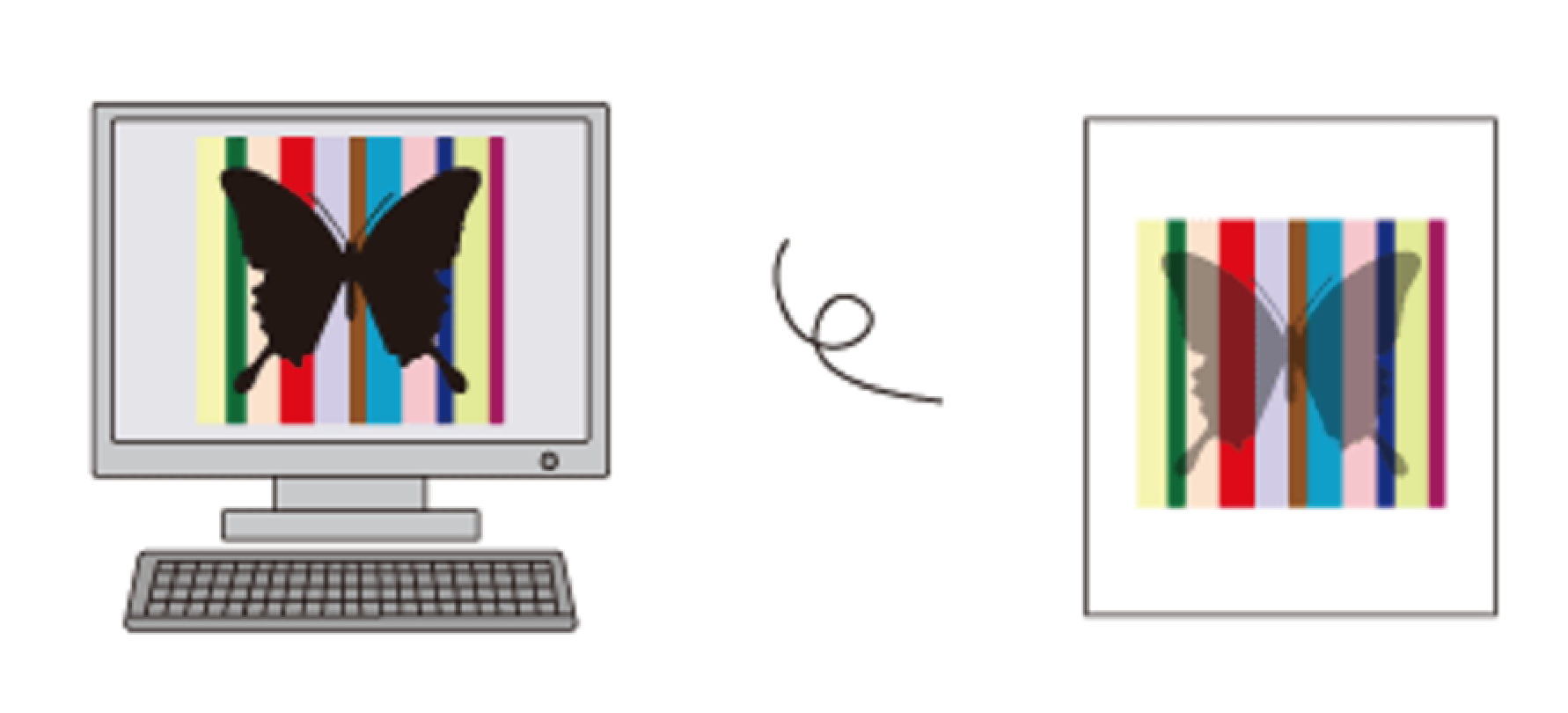
See-Through Black Phenomenon
Objects set to 100% black (K) will overprint by default, meaning they print on top of other colors rather than replacing them. This can cause the colors underneath to show through, creating an unintended transparent or "see-through" effect.
How to prevent this:
Choose one of these options:
- Change your black to 99% (K) instead of 100%
- Add 1% of CMY to your 100% black (creating what's called a "rich black")
- Use a rich black mix from the start (such as C=40, M=40, Y=40, K=100)
Any of these approaches will ensure your black prints as a solid, opaque color.
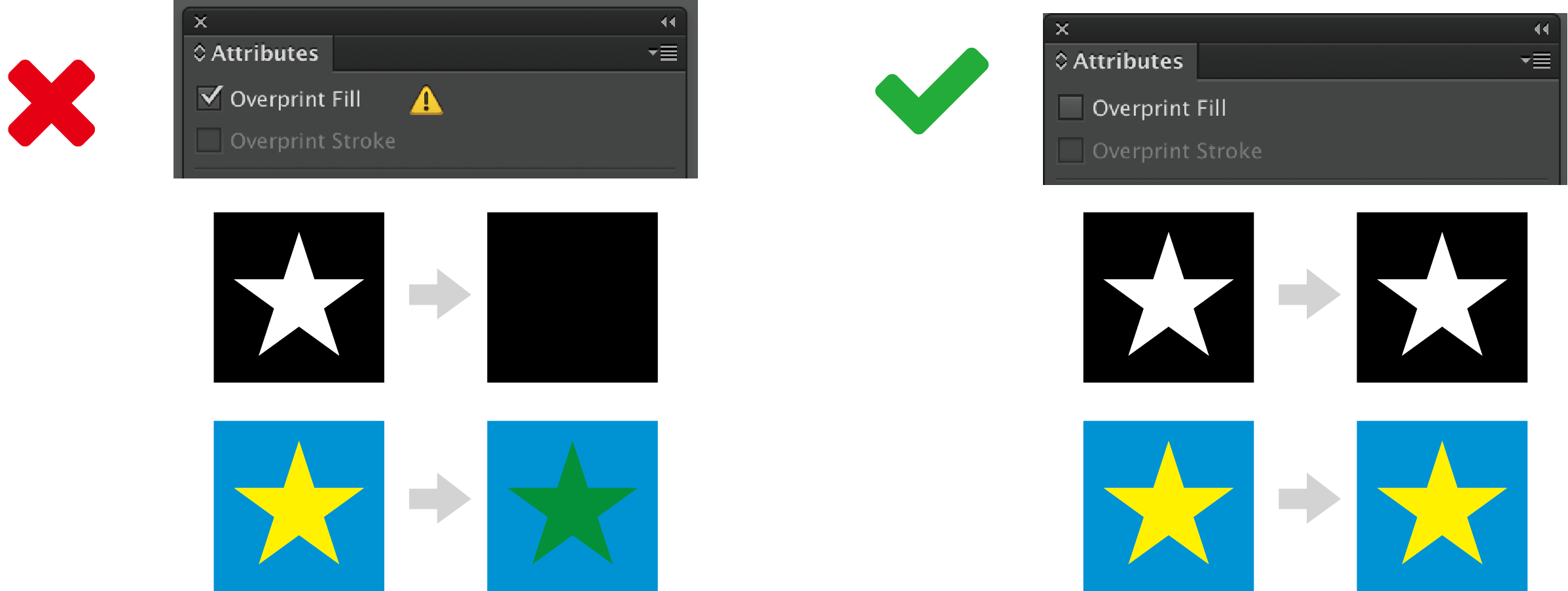
To Overprint or Not to Overprint
When black objects (K=100%) are set to overprint, they may appear differently in the final printed result than they do on your screen. Colors might look different, or in some cases, objects may seem to disappear entirely.
How to fix this:
Tip: Unless you're intentionally using overprint for a specific design effect, it's usually best to keep this option turned off.
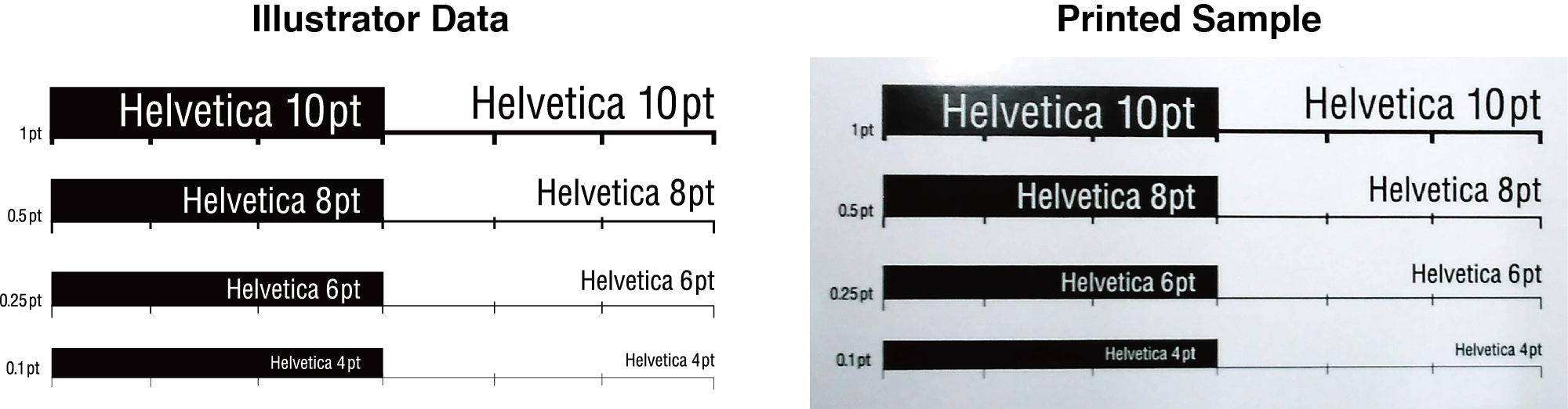
Font and Line Weights
Small text, thin lines, and hairlines might look fine on your screen, but they often don't print clearly. Tiny details can become illegible or disappear entirely when printed, so it's important to keep readability in mind.
Line thickness guidelines:
For solid-color lines: Don't go thinner than 0.25pt
For multi-color lines: Use at least 0.4pt thickness
Text size guidelines:
Keep body text at 6pt or larger as a general rule
This is especially important for fine print, disclaimers, or any small text in your design
Rule of thumb for small text is no smaller than 6pt. Keep this in mind when setting any small print within your designs.
Following these minimums will help ensure everything in your design prints clearly and professionally.
Spanning Text Across a Fold
If your design includes text that runs across a fold, consider how the fold might affect readability. Folding can sometimes create small creases or tears along the edge of the paper, making text harder to read.
Tip: If you must span text across pages, use larger font sizes and avoid placing critical information directly on the fold line.
When text crosses a fold line, the creasing can cause ink to crack or fade, making the text look less crisp and clean.
Half Fold
Folding deviation
Finishings such as folding, creasing, involve some natural variation. A slight misalignment in folds or binding is normal and falls within acceptable industry tolerances (typically +/- 1-2mm).
Keep in mind: Designs with high color contrast (like dark text on bright backgrounds, or bright borders against white) can make these small shifts more noticeable to the eye.
Design tip: Build a little flexibility into your layout near fold areas. Avoid placing critical elements or precise alignment requirements right at these points.


